Guidelines for UI elements

We review each submission to maintain the highest standards of design, functionality, and user-friendliness on our platform.
Adherence to these guidelines ensures the quality of content showcased. Let's uphold the excellence of our community together!
  • Hover, focus, active and other states will give you a higher chance of getting approved

  • Use em's when possible so that the dimensions are proportionate to font-size (this applies mainly to buttons, checkboxes, inputs…)

  • You can only have one element in each post (in most cases)

  • You can use SVG (both in CSS and HTML) as long as the SVG is not too big.

  • Use of CSS custom properties/variables is encouraged, but don't specify them globally (:root, body...).

  • Make sure your elements are accessible by web standards. Enough contrast, for example.

  • Elements should be unique or detailed enough, changing background color on hover is not enough.

  • If you're using any text, it should be either in English or Lorem ipsum.

  • Follow basic design principles like spacing, grouping, complementary colors, and so on…

  • Be subtle with shadows (in most cases)

  • JavaScript is forbidden. Any XSS attempts will get you banned.

  • We don't approve posts that are either already posted on Uiverse by you or someone else or they are too similar.

  • Adding tags that are not relevant to the post.

  • Don't style outside elements, like <body> or <html>

  • Avoid global styles, everything should be scoped to a class name

  • Any external links are not allowed and will be filtered out, this applies for images, fonts etc.

  • The use of SVG should complement the HTML & CSS, the SVG itself shouldn't be the main content.

  • Don't write CSS prefixes, code will be prefixed on the server.

  • Don't make your elements too big, try to keep roughly the same size as other elements in the category.

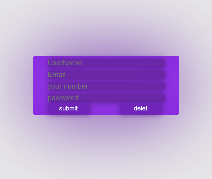
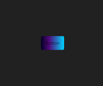
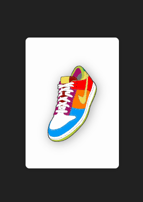
Examples of rejected UI elements

Check the following UI examples of how not to do things

imgrected
This is not a subtle shadow and the button is too big
imgrected
Bad spacing, alignment and contrast
imgrected
External images are not allowed
imgrected
Not enough contrast
imgrected
This SVG is too big and takes up about 270 lines in the HTML, this should be avoided
imgrected
Not enough added value

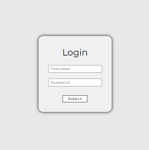
Examples of approved UI elements

Check the following ui examples

imgapproved
Good use of colors, shadows and hierarchy
imgapproved
Good size, similar to all other buttons on Uiverse and in the real world
imgapproved
Good SVG usage
imgapproved
Unique design
imgapproved
Good hierarchy, use of colors and SVG
imgapproved
Good SVG usage and custom color background