Uiverse Design - De-slop your AI generated websites | Product Hunt

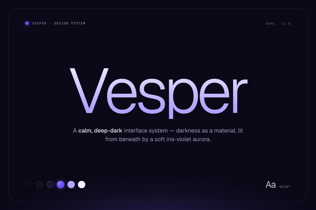
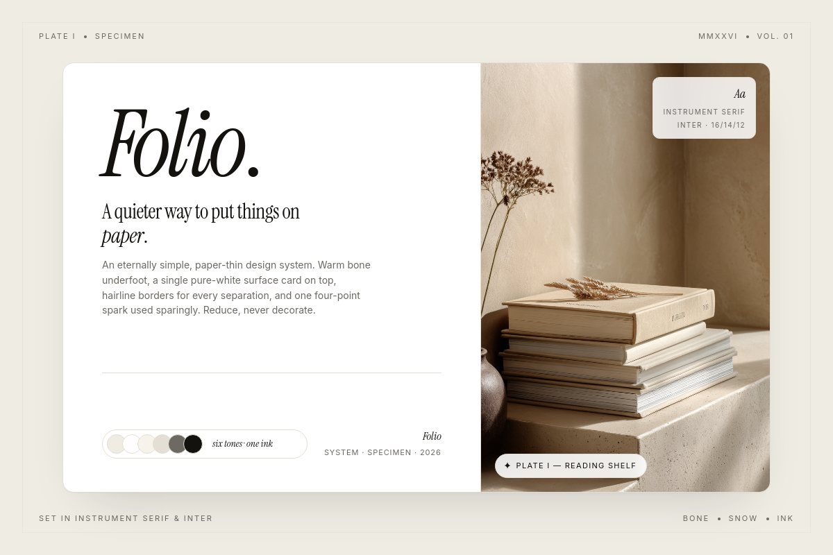
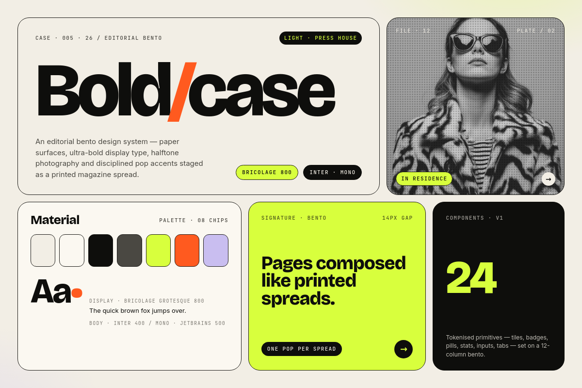
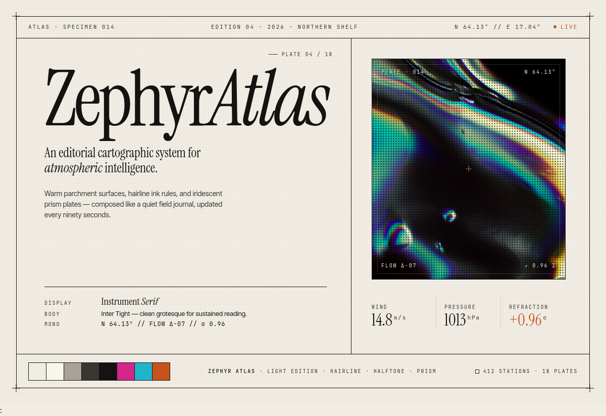
AI-first design systems

Drop the design system into any codebase and your coding agent instantly knows how to build consistent, polished interfaces.

Works with
Claude CodeCursorCodex+10
CompatibilityPlug and play with any popular coding agent.
  • Claude Code
  • Cursor
  • Codex
  • +And more
How to use
Polished interface built with the design systemGeneric AI-generated interface before the design system
BeforeAfter
Uiverse Design took our site from looking like $1 buck to $1 million bucks. 10/10 recommend
SE

Seb

Seicho

Uiverse's designs took my site from "OBVIOUSLY MADE WITH CLAUDE" to "THAT'S COOL!" in minutes. Easy, customisable, no-slop
SJ

Stefan Janse van Rensburg

RailReader

Great designs - easy to use in a lot of projects
MA

Martin

Its a solid set of design systems and the tests I did did bring nicer results. I'm currently using Open Design as Claude Design
GL

Gabriel Lopes

Uiverse design systems come with a DESIGN.md, so I point Claude at it and the visuals come out fantastic with minimal work.
CO

Conor O'Mahony

UIverse is basically Pinterest but for clean, copy-pasteable UI code.
DY

Dexin Yang

Uiverse design is a game changer. With plenty of styles of all types, it takes the time out of writing your own .md file.
BK

Brian Kelly

30 of 41 Results

Halo cover screenshot

Halo

Free

A modern, minimal, and scalable dark design system that pairs an architectural near-black canvas with precise typography and a tight palette of vibrant signal colors for product-grade interfaces.

Forge cover screenshot

Forge

Premium

An industrial-grade dark design system where ember-orange ignition heats a graphite-black workspace, tuned for dense technical product surfaces.

Boldface cover screenshot

Boldface

Premium

An editorial dark-mode design system for design-led portfolios and studio sites. Heavy display sans pairs with an elegant serif italic emphasis word on a deep cocoa stage, punctuated by a single tomato accent.

Cirrus cover screenshot

Cirrus

Premium

A minimalist, light-as-air SaaS design system built around a calm cloudy sky background, pill-shaped controls, and a single italic serif accent that punctuates an otherwise restrained sans-serif voice.

Cairn cover screenshot

Cairn

Premium

An editorial dark infrastructure system. High-contrast serif headlines sit on a near-black canvas, broken only by hairline grids, atmospheric landscape stills, and a single mint accent.

Vista cover screenshot

Vista

Premium

A bold editorial dark navigation system for travel and discovery products, anchored by centered typographic menus and peeking image thumbnails.

Tangerine Capital cover screenshot

Tangerine Capital

Premium

An editorial finance design system built around oversized display type, warm tangerine surfaces, and cream-on-orange contrast. It blends magazine layout rhythm with investment-product clarity for landing pages, briefings, and dashboards.

Marginalia cover screenshot

Marginalia

Premium

A school-notebook design language built on ruled cream paper, ink-blue lines, and a red margin rule. Components feel like neatly written entries, sticky notes, and tabbed pages from a classroom journal.

Lucidbloom cover screenshot

Lucidbloom

Premium

A psychedelic dark design system for editorial, music, and lifestyle products that lean on saturated imagery, liquid gradients, and hand-drawn cosmic ornamentation.

Chicago 95 cover screenshot

Chicago 95

Premium

A retro desktop OS design system rebuilt for the modern web. Beveled silver chrome, navy title bars, and pixel-tight typography evoke the chunky charm of mid-90s computing.

Tessera cover screenshot

Tessera

Premium

An editorial dark design system that pairs italic serif headlines with crisp sans body, deep forest surfaces, and a vivid chartreuse action accent. Signature 3D isometric block motifs add volume and rhythm.

Prismfield Studio cover screenshot

Prismfield Studio

Premium

A creative studio dashboard system that frames a calm editorial-white interior in a holographic chromatic glow, with pixel-glitch motifs and crisp hairline geometry.

Marque cover screenshot

Marque

Premium

An editorial brand identity and design system handbook with deep violet ink, layered lavender surfaces, and confident geometric typography.

Mosaic Press cover screenshot

Mosaic Press

Premium

An editorial mosaic system that stacks cream, ink, and electric accent tiles into confident card grids with serif headlines and modular sans labels.

Mossforge cover screenshot

Mossforge

Premium

An industrial-warm design system that pairs cream paper surfaces with deep evergreen panels and a charged lime accent for confident, data-led product pages.

Penumbra cover screenshot

Penumbra

Premium

A clean, minimal dark design system built around fine hairline borders, atmospheric surfaces, and a refined serif-meets-grotesk type pairing.

Obra Studio cover screenshot

Obra Studio

Premium

A warm-dark editorial design system for creative studios, pairing gilded display typography with deep ink surfaces and elegant serif italics.

Aether cover screenshot

Aether

Premium

An editorial dark design system for intelligence and topology products, where brutalist grids and oversized italic serifs collide with prismatic chromatic glass.

Crimson Plinth cover screenshot

Crimson Plinth

Premium

A calm, paper-light interface system where every surface stays flat and only the primary action wears a tactile, layered crimson press button.

OVERWORLD cover screenshot

OVERWORLD

Premium

A pixel-art editorial design system for worldbuilders, indie game studios, and digital cartographers. Chunky 16-bit landscapes punch through oversized blocky display type on warm parchment.

Verdara cover screenshot

Verdara

Premium

An editorial-warm sustainability journal where chunky display serif headlines, color-blocked cards, and a radial petal mark turn climate stories into a confident, magazine-grade reading system.

Frame & Field cover screenshot

Frame & Field

Premium

An editorial design system for a creative production studio, built on heavy display type, generous whitespace, and silent black-and-white restraint.

Schemata cover screenshot

Schemata

Premium

A schematic light-mode design system built on structure, clarity, and flexibility — pairing editorial sans-serif typography with technical monospaced labels and a vivid indigo-violet accent.

Vellum Tessera cover screenshot

Vellum Tessera

Premium

A warm, light design system that pairs cream tessellated surfaces with a refined teal-to-iris gradient glow. Generously rounded shapes and layered soft depth give product UI a sunlit, hand-pressed feel.

Verda Finance cover screenshot

Verda Finance

Premium

A bold dark-mode fintech design system that pairs a vivid mint accent with deep ink surfaces, oversized editorial display type, and confident pill controls for modern banking interfaces.

Vesper cover screenshot

Vesper

Premium

A calm, deep-dark interface system built around layered indigo surfaces, ambient violet glow, and ultra-rounded pill controls for modern SaaS and productivity products.

Voltura cover screenshot

Voltura

Premium

A dark-luxe trading workspace where inky olive panels float on a sun-baked citrine field and one acid-lime focal card always carries the eye.

Folio cover screenshot

Folio

Premium

An eternally simple, paper-thin design system built on warm neutrals, hairline borders, and editorial serif headlines.

Boldcase cover screenshot

Boldcase

Premium

An editorial bento design system for creative studios — oversized display type, halftone photography, and pop accent colors set against a warm paper surface.

Zephyr Atlas cover screenshot

Zephyr Atlas

Premium

An editorial cartographic design system for atmospheric data and intelligence platforms. Warm parchment surfaces, hairline rules, and iridescent prism imagery balance scientific precision with poetic restraint.

Frequently asked questions

Quick answers about what you are buying and how to use it.